
Designing Clarity Into Complex Tools (Lessons from Tool Matrix)
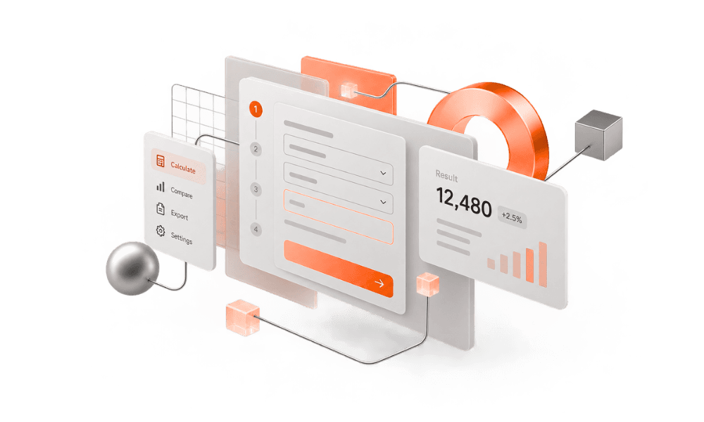
Table of Content

Multi-step calculation tools fail in a particular way. The math can be fine. The feature list can be complete. And still the interface makes you hold too much at once — scattered fields, options that compete with the job, and an answer that shows up without enough context to trust it.
That is the problem I cared about when I built Tool Matrix: how do you make a calculation workflow understandable while it stays capable?
What Tool Matrix Is
Tool Matrix is my university Final Year Project from 2024 — a web app and calculation toolkit built for speed and clarity. I designed and built it. The job was clear: make everyday calculations faster and easier to follow.
In practice, it turns messy, multi-step calculations into something you can run quickly in the browser. The interface was built around clarity first — less noise, obvious inputs, and results you can trust without digging through menus. On the portfolio it sits under product design, frontend, and brand basics, tagged for productivity and education-tools contexts. The live app is at tool-matrix.vercel.app; the fuller project notes are on the Tool Matrix page.
Complexity here meant multi-step calculation work in the browser. That was enough of a design problem.
Clarity Starts With Less Noise
The first useful decision was subtractive. Before polish, I asked what the screen could stop saying.
Multi-step tools gather visual weight easily — competing hierarchy, chrome that looks important, secondary actions that sit at the same visual level as the primary path. Noise is anything that competes with the next useful action. Mid-calculation, you should not have to re-orient yourself on every step.
So the UI stayed restrained. Clean system-style sans for headings and interface text. A tight palette from the project design system — Metallic Brown (#a4481e), black, Gunmetal (#2b2e32), white, Alice Blue (#f1f1fd), Anti-Flash White (#eff2f7) — enough contrast to guide attention without turning the product into a mood board.
Less noise does not mean fewer capabilities. It means the interface stops performing for its own sake. If something does not help someone enter values, understand state, or read a result, it probably does not belong in the primary view.
Make Inputs Obvious
Trust starts before the result. If the inputs feel ambiguous, the output feels optional.
For a calculation toolkit, that is a practical bar. Labels should say what a field is for. The path from knowing what you need to having entered it should be short and readable. Advanced options should not sit at the same level as the everyday path.
Used carefully, progressive disclosure helps: keep the main job visible, and reveal extra controls when they are needed. The point is not to hide power forever. It is to stop making every visitor start by digging through menus for the calculation they came to do. The job should sit on the surface. Configuration can wait.
Results People Can Trust
A calculation UI fails quietly when the answer appears but confidence does not.
Trustworthy results are not only about the math. Presentation matters: enough context to feel inspectable — what was computed, from which inputs, and where to look if something seems off. Loud output with thin information gets second-guessed. Buried output does not get a second visit.
I wanted Tool Matrix to feel like a tool you can run and move on from. Speed without trust is just a faster way to feel unsure. In a multi-step flow, each step can introduce a small ambiguity; if the interface does not resolve those as you go, the final number inherits them. Trust is a path, not only a last screen.
Design and Frontend as One Owner
On Tool Matrix, product design and frontend were not separate handoffs. I owned both. That mattered for the kind of clarity I wanted.
When the same person sets hierarchy, labels, spacing, and interaction behavior, fewer decisions get diluted between a mock and a merge. A restrained palette stays restrained in code. Input affordances do not drift. Result states do not become an afterthought because the frame looked fine in a design file. Design systems on paper are useful; ones that survive implementation are better.
That single-owner loop is also how I prefer to ship product UI more broadly — judgment and the frontend that has to carry it, without a long handoff chain.
What Carries Into Other Products
This Final Year Project demonstrated principles that carry into other product and SaaS work. Tool Matrix itself was not a commercial SaaS product. The same questions still apply when the surface is product UI, including SaaS: What is the job on this screen? What can we remove without removing capability? Are the inputs unmistakable? Can someone trust the output without hunting through the interface?
Founders and product teams often do not need a denser feature set first. They need the existing workflow to feel obvious. If you are weighing Product UI/UX help, or thinking about how a SaaS & Web experience should feel mid-task, this is the standard I design toward: calm primary paths, disciplined secondary detail, and results that earn confidence.
Clarity is not anti-complexity. It is how complex work stays usable.
If You Are Building Something That Needs to Feel Clear
If this resonates — a calculation-heavy workflow, a productivity tool, or a broader product UI — start with the work itself. Open tool-matrix.vercel.app, and read the notes on the Tool Matrix project page.
I work as a Senior Lead / Full-Stack Product Engineer based in Faisalabad, Pakistan. If you want that kind of ownership on your product, look at Product UI/UX and SaaS & Web, then get in touch.
Portfolios can show screenshots. Tools reveal whether clarity survived contact with a real job. Tool Matrix was my way of insisting that it should.